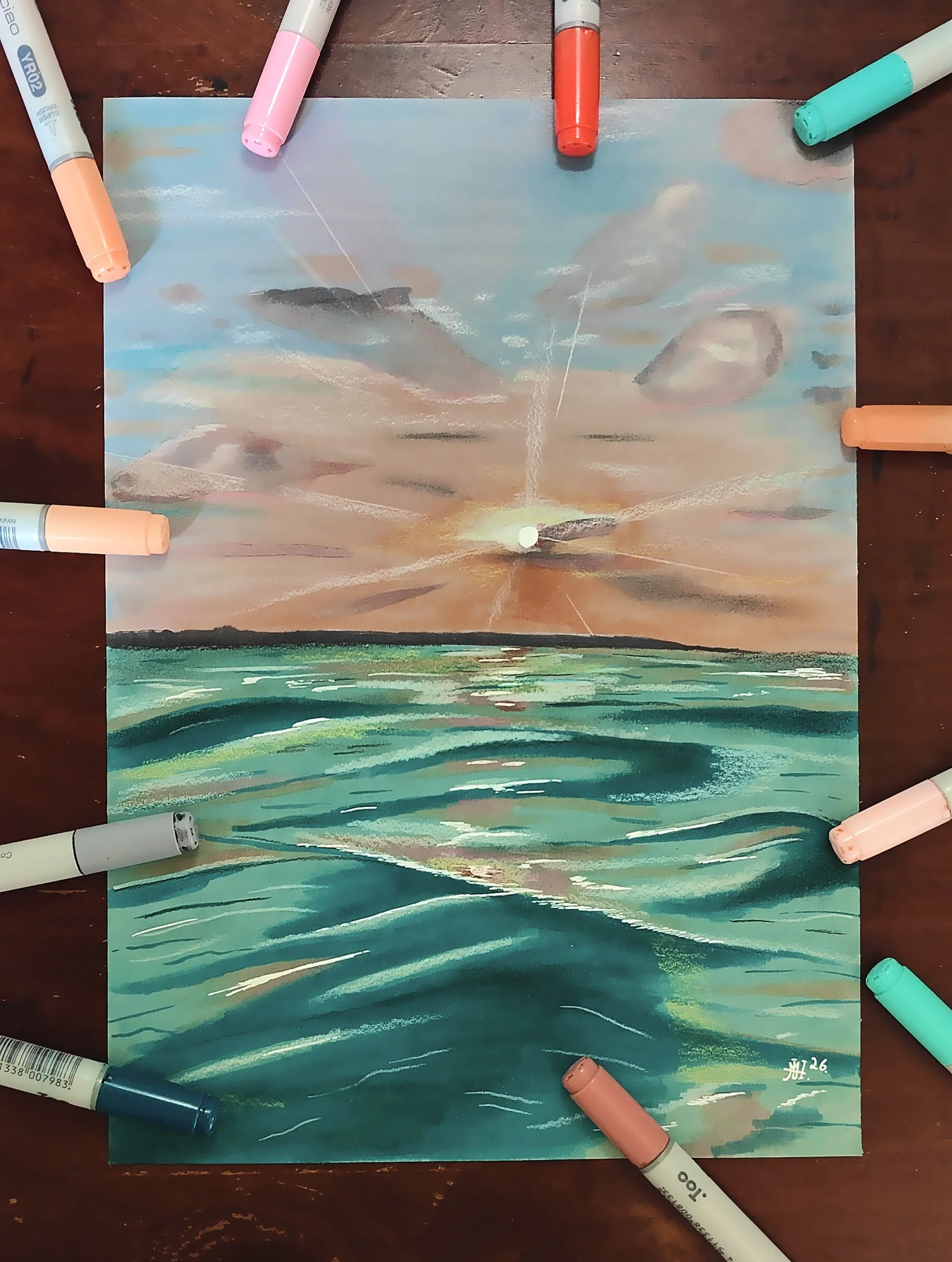
Ocean Horizon Drawing

Hey everyone! Welcome to another art blog. Over the last few weeks I’ve been in the mood to draw something with a lot of colors. I get that urge from time to time, so then I looked through all of the drawings I’ve made recently, I realized that I haven't done something like that in months. I could also see that I haven't made a landscape/outdoor drawing in ages, so I wanted to combine those two categories and work on this colorful sunset illustration.
I used my grey toned paper for this drawing, as it can dampen some of the wild pastel colors that I knew I was gonna use. I also had a piece of paper next to me to figure out the which colors worked best with my idea. It is very important to have this paper near by for testing, because you can very easily ruin all your work with the wrong color.
For the sky I used a mix Orange and pink markers, around the sun I gently tapped a few times with a salmon red marker (R05).
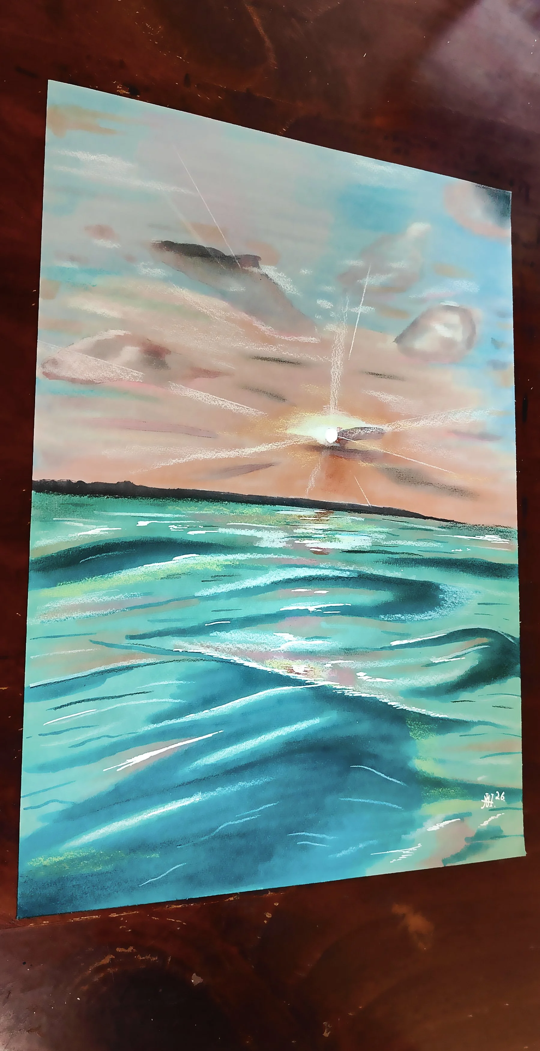
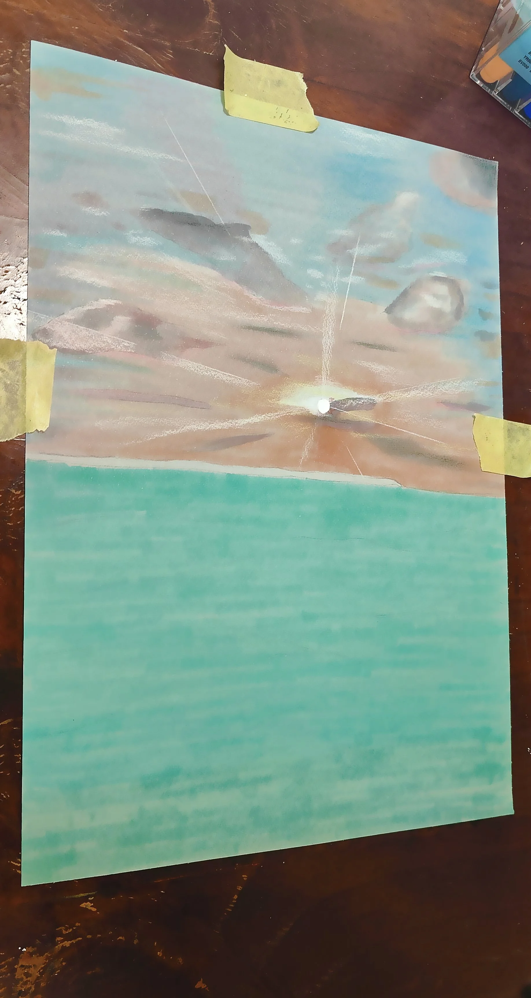
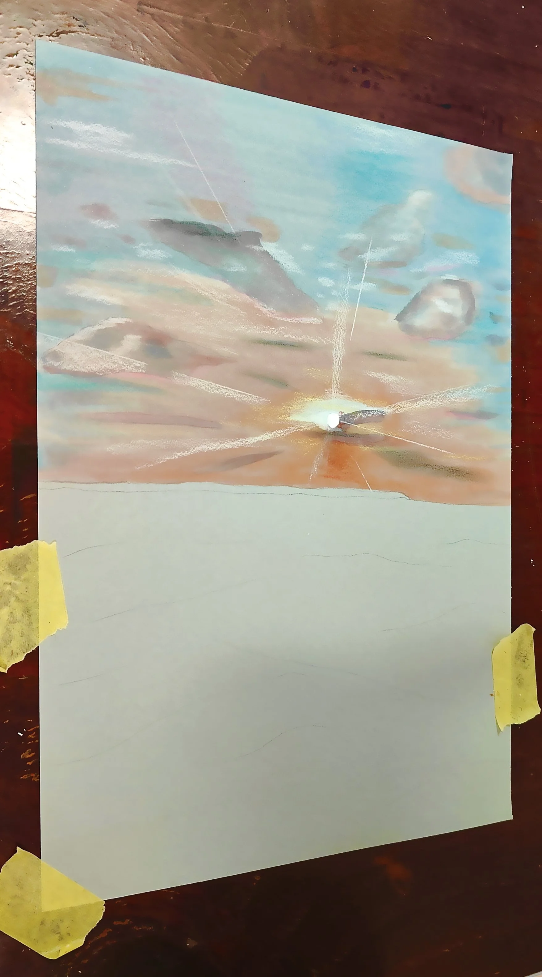
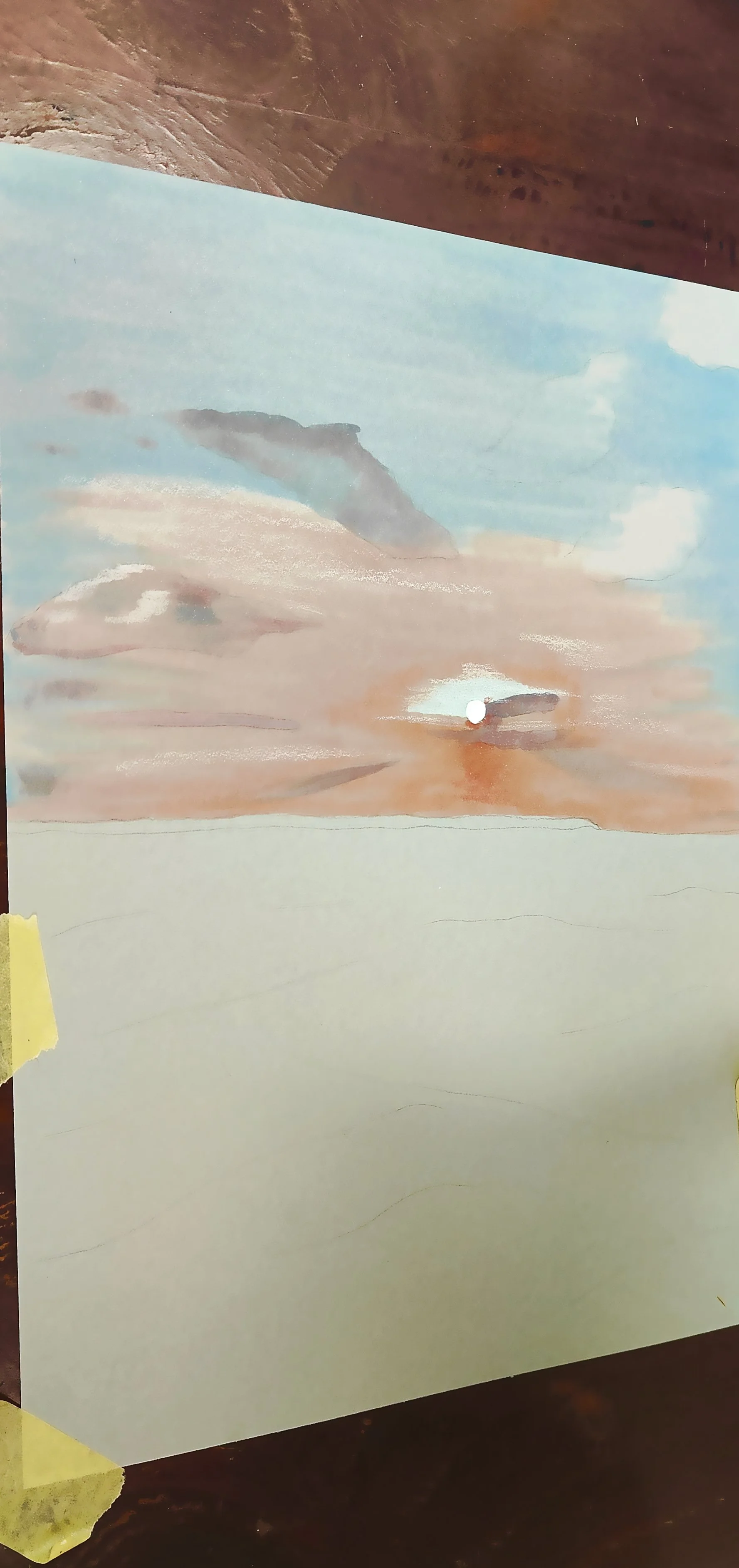
It was the strongest marker for the entire sky, and I did'nt want to use a lot of it, and I knew that I would saturate it with all the over markers when I got to the blending. For the rest of the orange tones I went from Dark to light using light orange, (YR02) rose salmon, (R02) and tea orange (E95)
For the clouds and the blue/pinkish tones in the sky I used cool Grey 3, and 5, a black pencil, Ice blue (B12) and pale blue (B32), light pink, (RV21) blush, (R20) and lipstick natural (E04). With most of these markers I just gently touched the paper as I did'nt want any hard lines or contrast, the smoother, the better. In the end I used a white pencil for details in the clouds, a pink pencil, a yellow pencil, and a blue pencil to add a bit of depth and color variation to the sky.
The water was actually almost the easy part as I only used two markers. A Coral Sea (BG23) and a blue green marker (BG09). I went over the entire surface of the water with the Coral Sea marker, and afterwards made the small wave details with the blue green marker. Then I went over everything again with the Coral Sea. To add the reflection of the sky I used the some of the same markers of course. That being rose salmon (R02) and the blush marker.(R20) I did also use all the pencils i used in the sky, for smaller detailing. And of course a white gelly roll pen for a lot of reflections.
I usually don’t like to work on very colorful pieces, as I feel like the more muted drawings with very little color makes that color stand out and pushes the drawing where I want it to, hence my excessive use of grey and toned tan paper but this one I’m really satisfied with... It is always fun to do something different and sometimes use colors that I never use. I hope you enjoyed this weeks blog and maybe some of my tips helps you on your own art journey! Hope to see you all in the next blog.
See Video for this piece on Violeta Ink’s Instagram page!

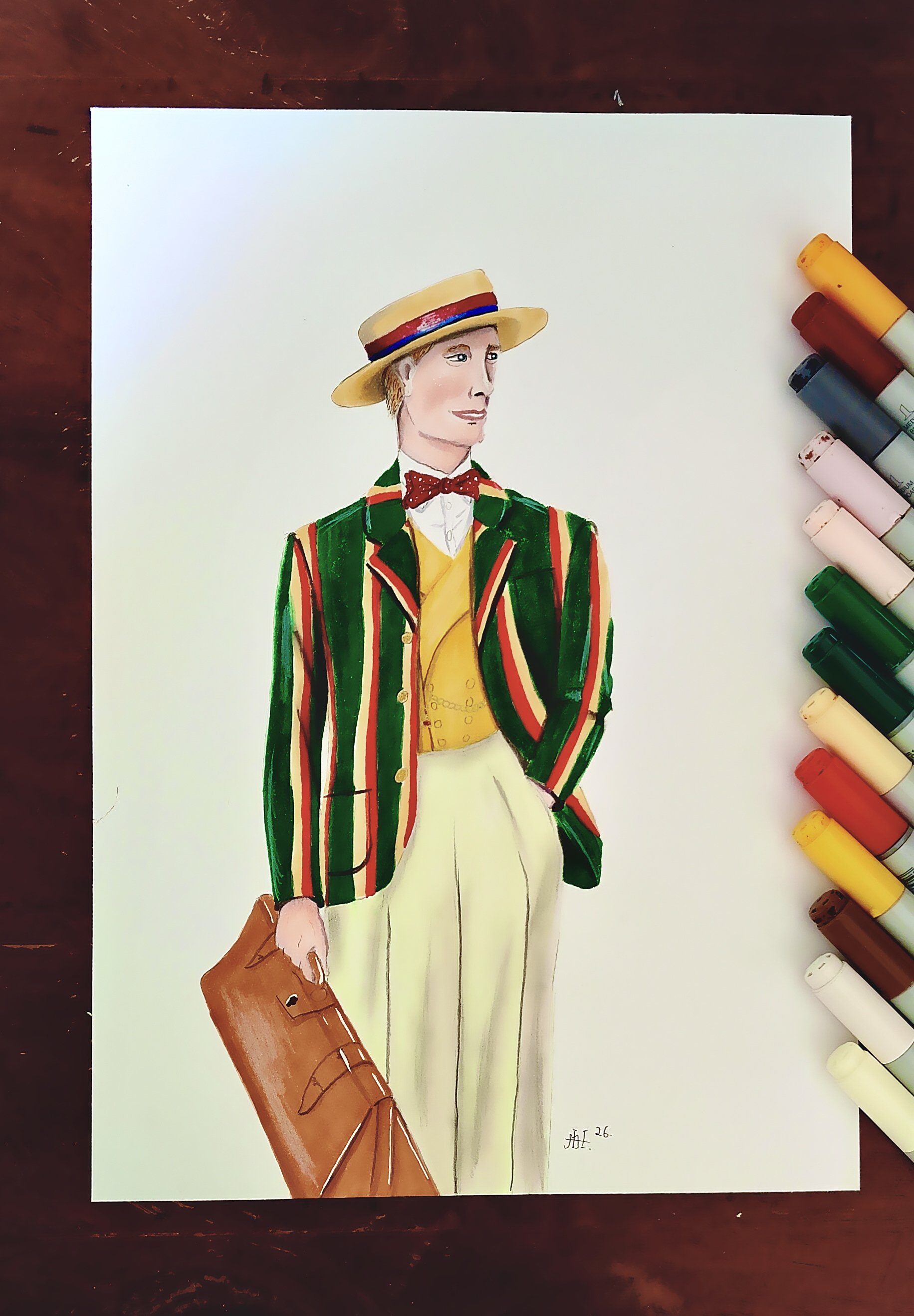
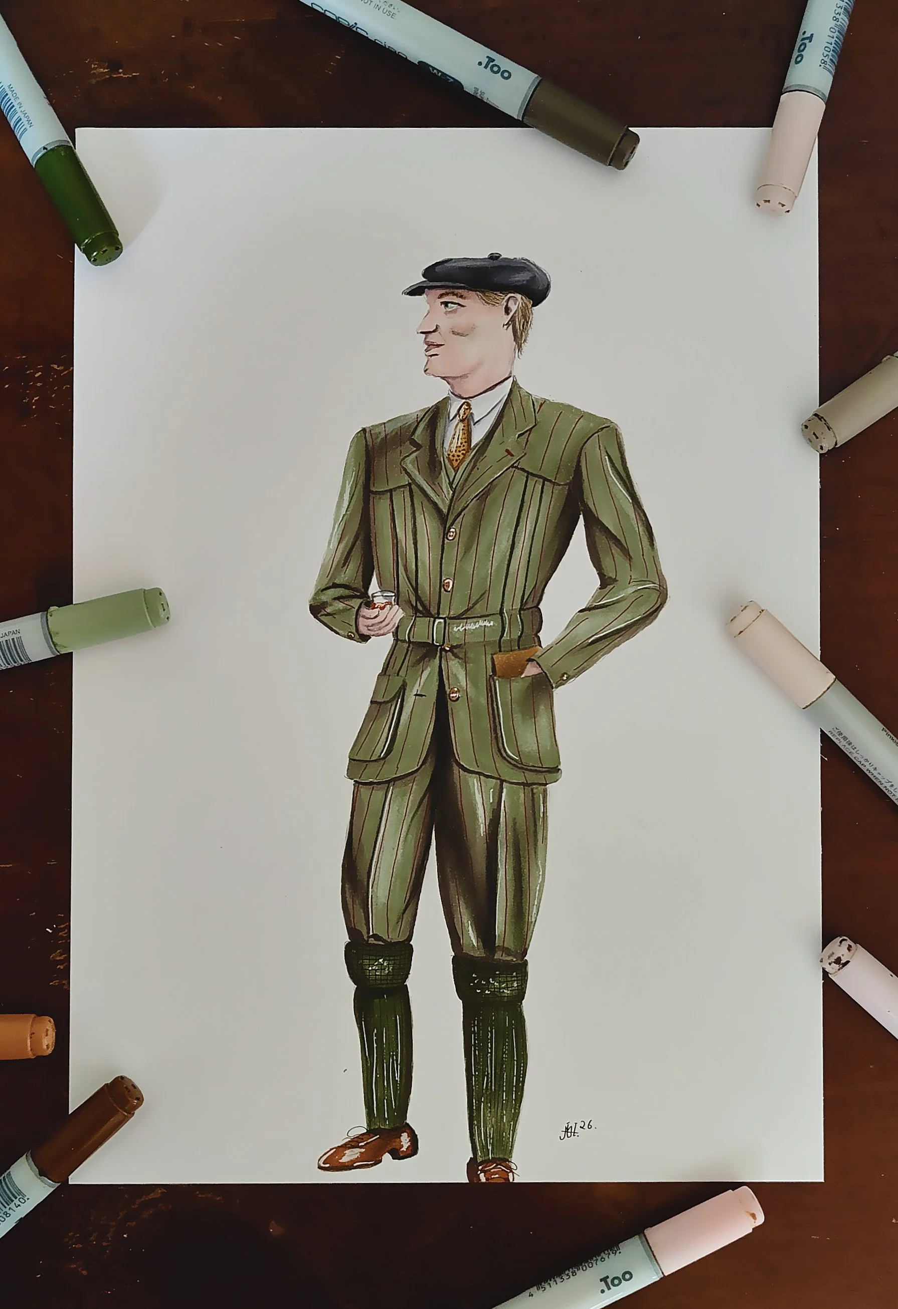
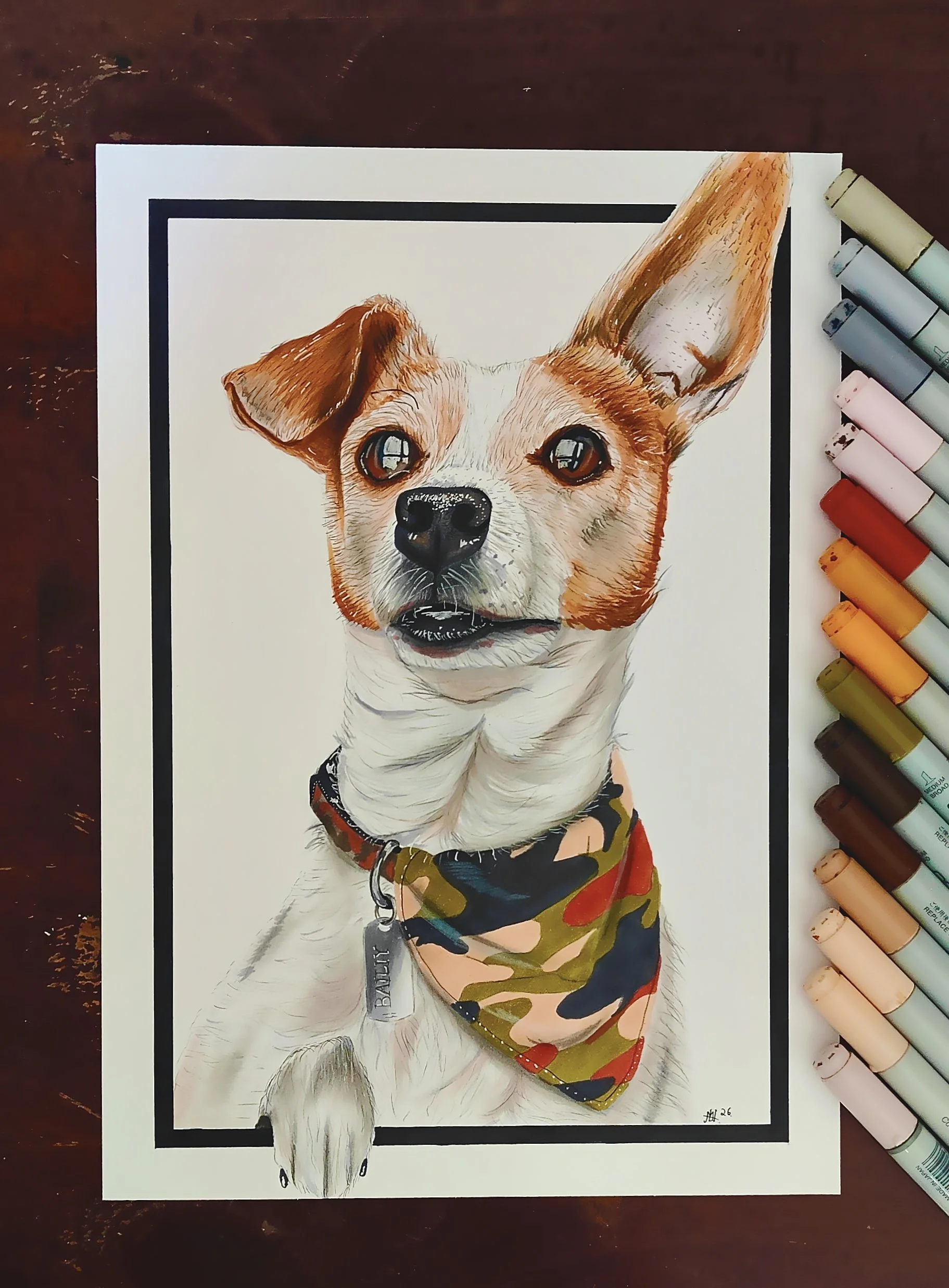
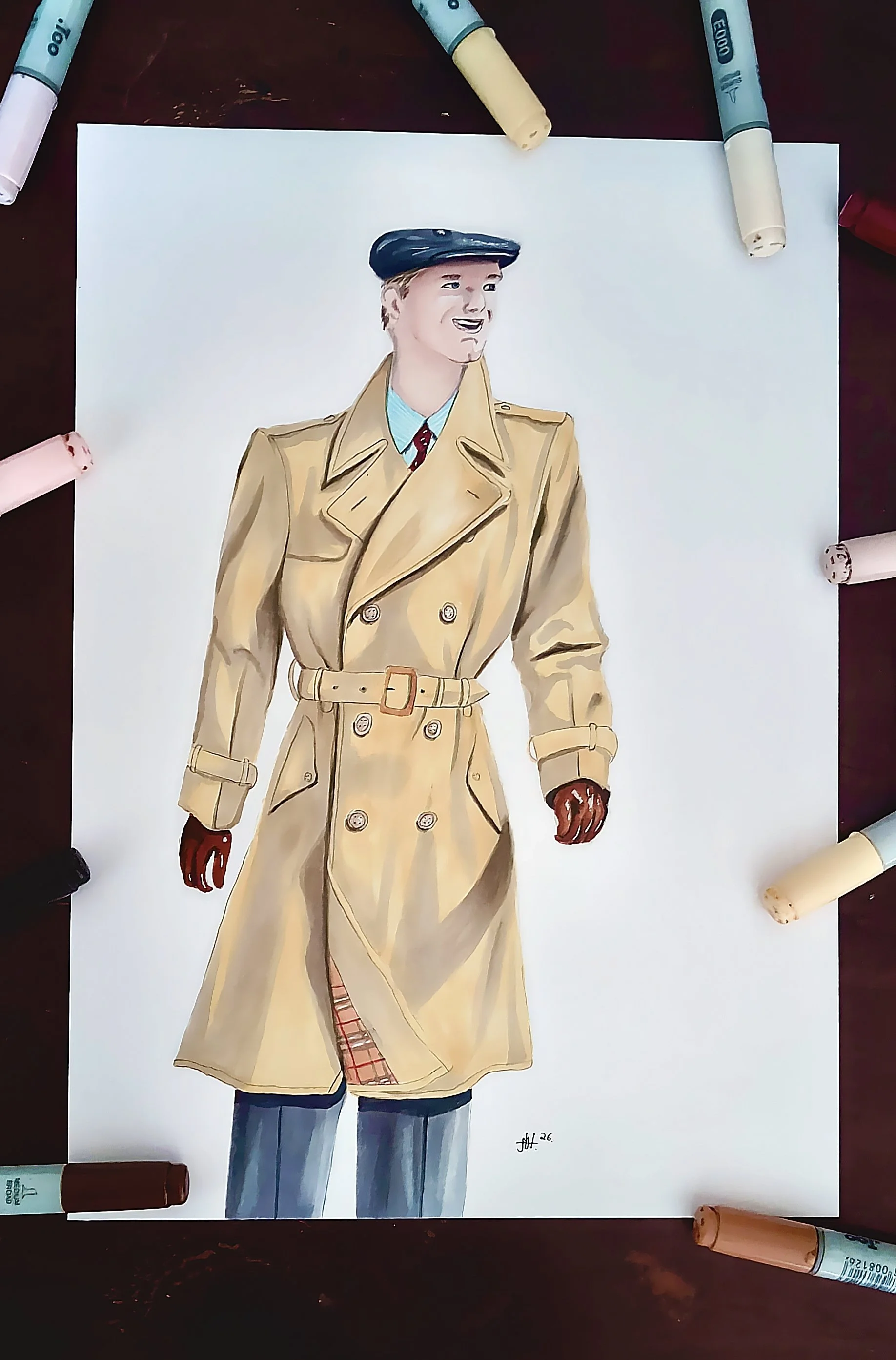
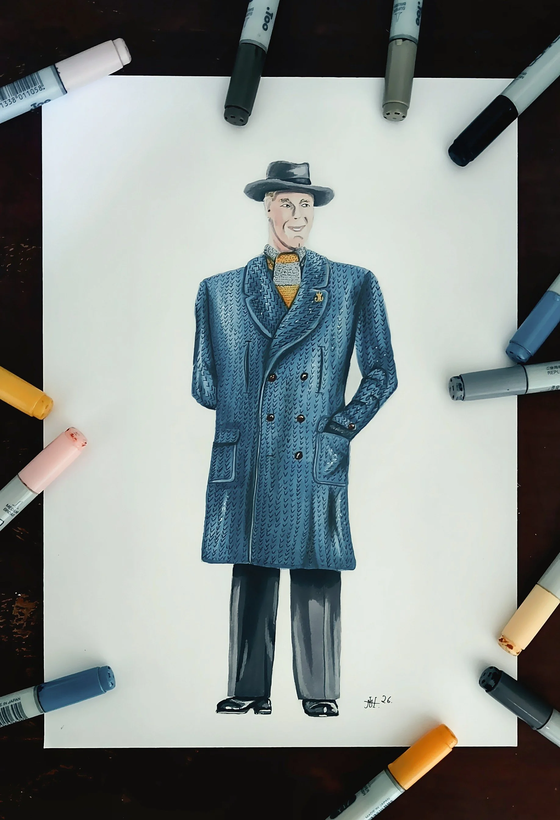
Art By MicoH
My name is Mico. Im 24 years old, and from Denmark. I've been drawing for about 10 years, and I've been using Copic Markers for 5 years now. Im completely self taught.
(Copic Marker Artist and Contributor for Violeta-Ink.com)
SHOP HERE

Violeta News
When you join our newsletter you will receive the Free Downloadable Swatching Template I use on every video.
Subscribe by clicking.
We do not send spam or share our mailing list.
It’s easy to unsubscribe!
Violeta Ink is a participant in the Amazon Services LLC Associates Program, an affiliate advertising program designed to provide a means for use to earn fees by linking to Amazon.com.