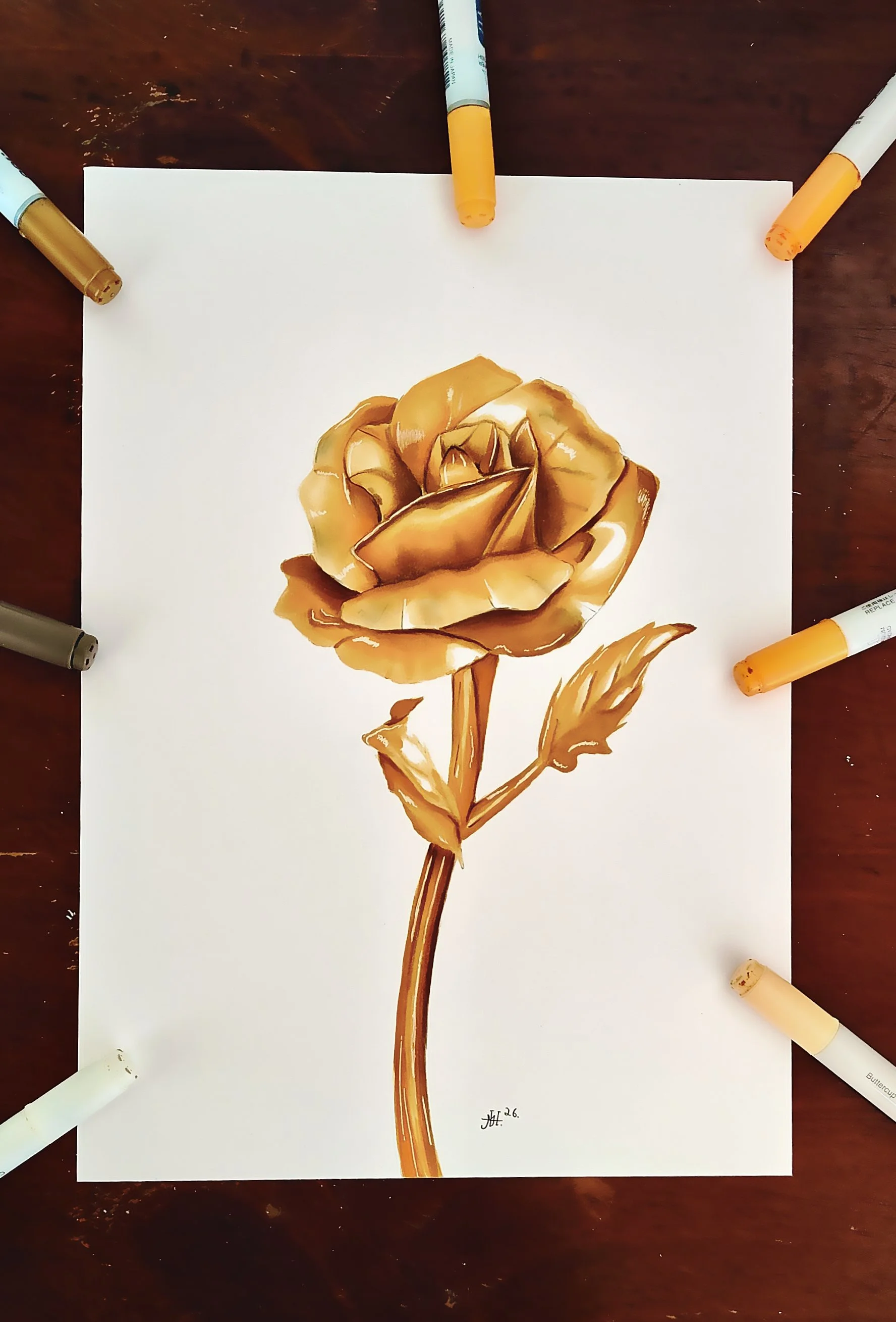
Kingfisher drawing
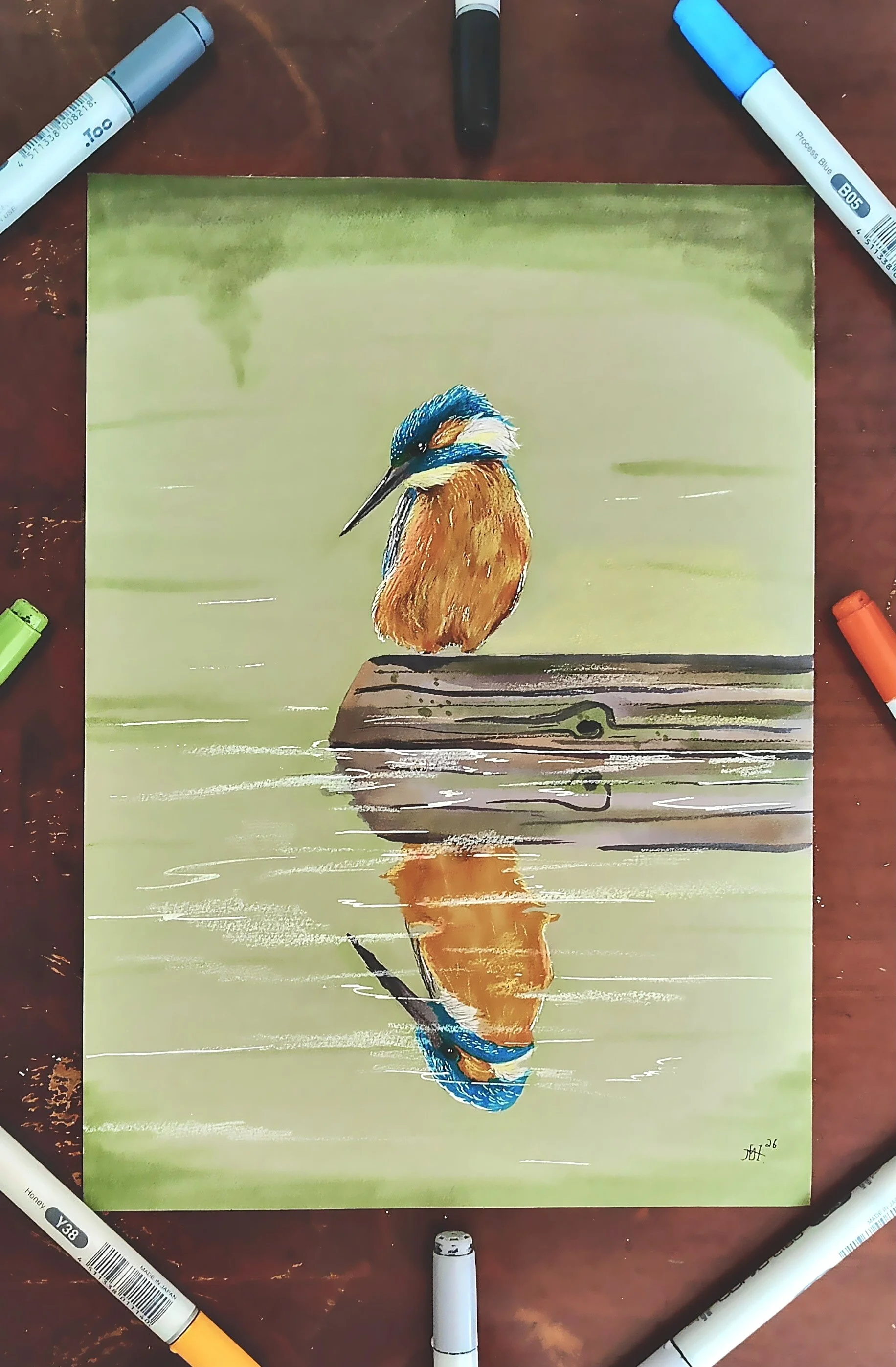
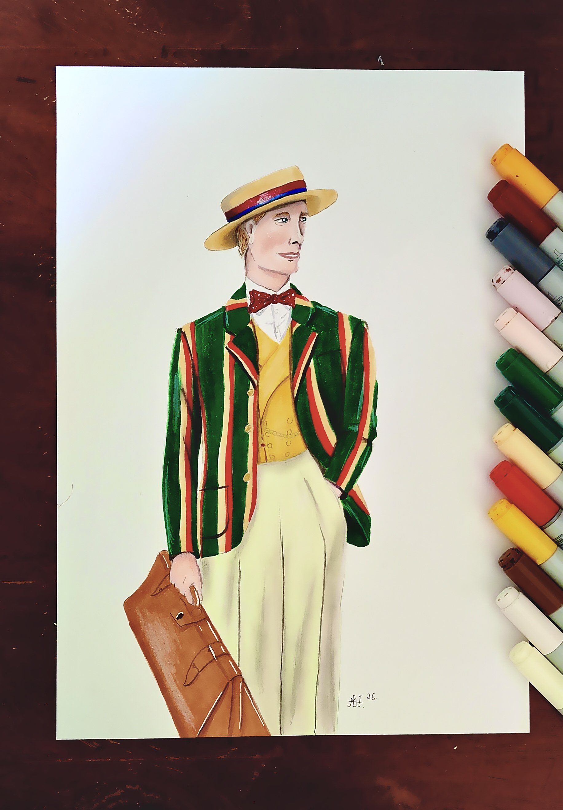
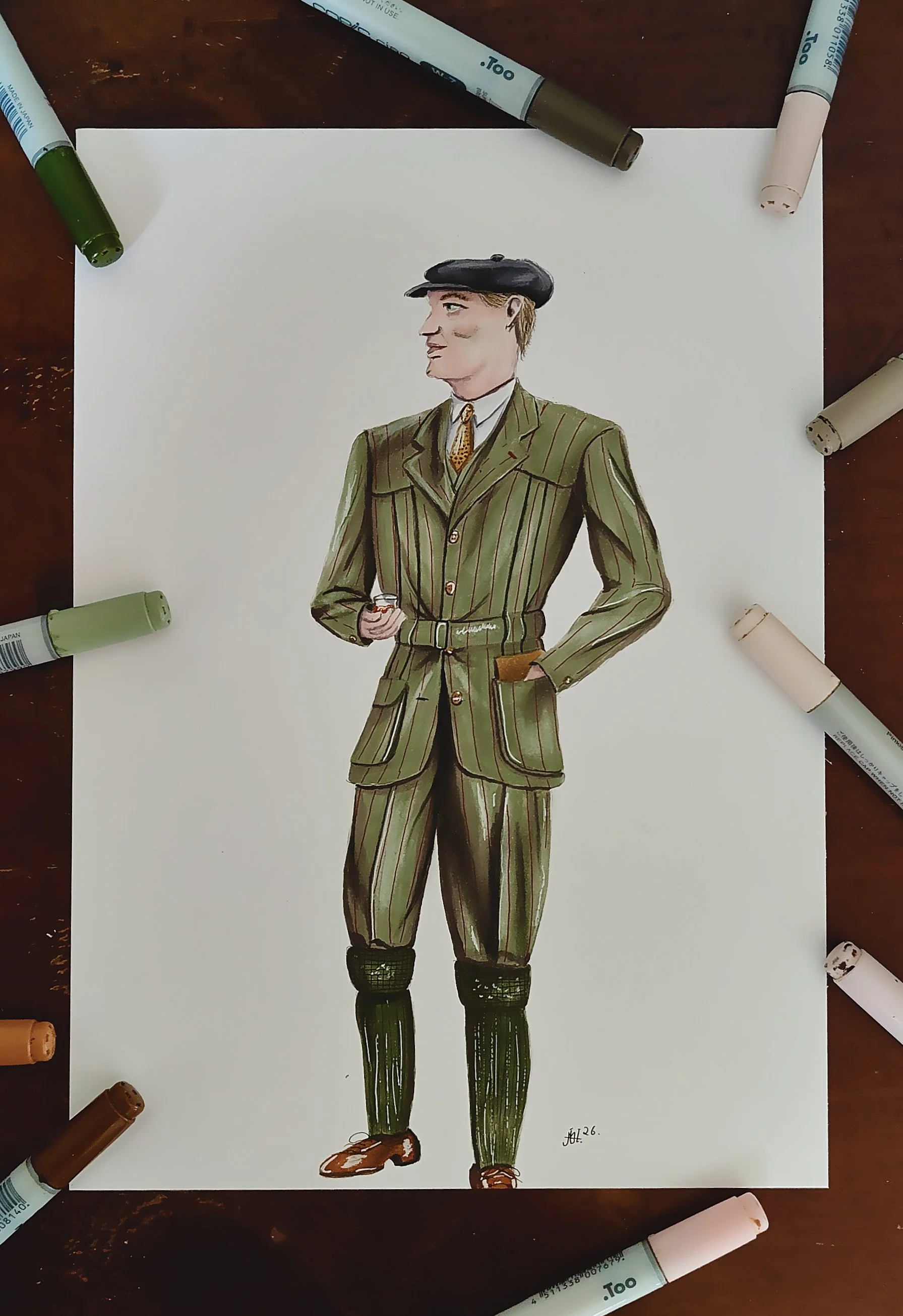
Hey there! Welcome to this blog post. For this weeks entry, Ive been working on a very simple summer outfit. The heat is here and it can be somewhat difficult to wear nice clothes when the sun i burning all day, but i still tHey there everybody and welcome to this blog post. For todays post im working on a sketch of one of my favorite birds... Ive always been very fascinated with the kingfisher. My favorite color is blue, and i do really like the blue and orange tones on this bird and how welll the colors complement each other. Ive actually been trying to draw one for a while, but Ive never gotten around to do it until now.
I made the decision to use Grey toned paper for this, and i did that because this paper dosen't absorb as much ink as my regular paper, and i knew that i would be using a lot of ink for the background. For this drawing i actually started with the background which i almost never do, but i wanted to make a very light green background, and since the bird is gonna be that much darker, i thought it was a good idea.
For the background i did what i always do when it comes to larger areas that need color. I split it up into sections. In this case the top and the bottom of the piece. When i overfilled my marker to the point where it was dripping with ink. In this case it was mignoette. (YG11) And for some of the edges i used pea green. (YG63)


For the kingfisher itself i used cool Grey 5 7 and a black marker for the beak, the eye and the smaller part of the wing to the left side. For the blue tones i used process blue (B05) and blue green (BG09) for the shading. I used my smallest white gelly roll pen a lot on this drawing for details like highlights and the feathers. For the orange area i used honey, (Y38) and a brown marker. (E08) I did also use a yellow pencil and a white pencil for different color variations in that area.
For the piece of wood i used a bunch of different colors. I started with a simple layer of cool Grey 3 and when i worked my way up with cool Grey 5 and 7. After that i used pea green, (YG63) and sand (E33) for a bit of color, i went over it a few times until i was satisfied. Towards the end i used a white pencil and my 0,8mm white gelly roll pen to create the illusion of reflections in the water and i think it worked pretty well, and then this drawing was completed. I do really like how this one turned out and im happy to have been working on a drawing with a fully colored background like this again. I hope you all enjoyed this blog post and i will see you all in the next one.

Art By MicoH
My name is Mico. Im 24 years old, and from Denmark. I've been drawing for about 10 years, and I've been using Copic Markers for 5 years now. Im completely self taught.
(Copic Marker Artist and Contributor for Violeta-Ink.com)
SHOP HERE

Violeta News
When you join our newsletter you will receive the Free Downloadable Swatching Template I use on every video.
Subscribe by clicking.
We do not send spam or share our mailing list.
It’s easy to unsubscribe!
Violeta Ink is a participant in the Amazon Services LLC Associates Program, an affiliate advertising program designed to provide a means for use to earn fees by linking to Amazon.com.