
Best Copic Markers for Skies and Clouds
Quick answer: If you want a beautiful starter collection for coloring skies with Copic markers, begin with B000, B00, B02, B04, BV000, RV10, R20, Y00, YR00, YR02, B91, B93, B95, and B97. These colors give you a flexible range for clear blue skies, pastel sunsets, golden hour clouds, and moody stormy skies.
Choosing Copic markers for skies can feel overwhelming at first. There are so many blues, blue-violets, yellows, and warm sunset shades that it can be hard to know which markers actually work well together.
We’ve gathered some of our favorite Copic color combinations for skies so you can create everything from bright daytime skies to soft cotton candy sunsets and dramatic storm clouds.
Whether you’re coloring stamped images, landscapes, background scenes, handmade cards, journals, or illustrations, these sky palettes give you a beautiful place to start without needing to buy every blue in the Copic system.
Best Copic Sky Color Combinations
Explore Copic marker color combinations for skies, sunsets, clouds, and dramatic weather. These recommended palettes from Violeta Ink make it easier to choose the right Copic colors for daytime skies, dreamy moonrises, golden sunsets, and storm clouds. Shop Copic markers at Violeta-Ink.com.
| Sky Illustration | Original 4-Marker Palette | Optional Accents |
|---|---|---|
| 1. Fluffy Clouds |
B000
B00
B02
B04
|
B0000
C0
C1
C3
|
| 2. Dreamy Moonrise |
B000
BV000
V04
B63
|
BV02
BV04
B24
YR00
Y00
|
| 3. Golden Sunset |
Y00
YR00
YR02
R20
|
Y17
YR04
YR07
R22
RV93
BV23
|
| 4. Storm Clouds |
B91
B93
B95
B97
|
C3
C5
C7
B99
B0000
B000
|
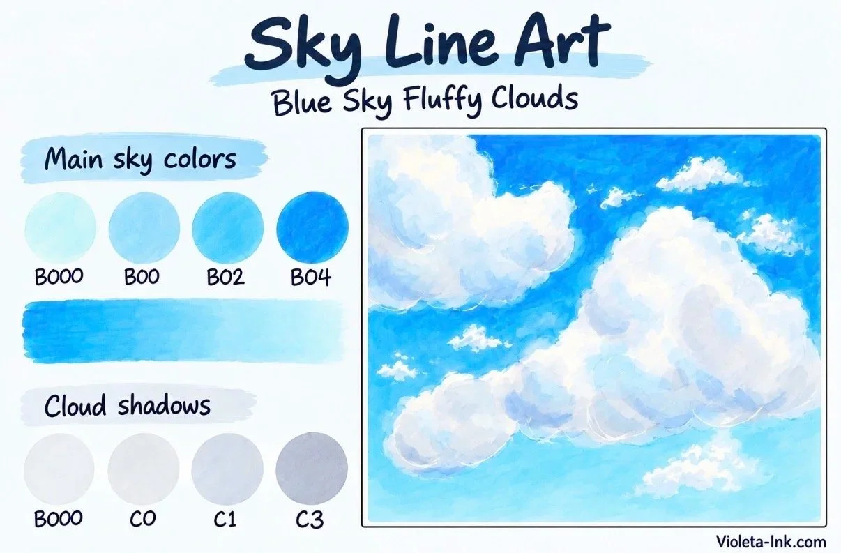
Blue Skies Ahead | Fluffy Clouds
Main Copic colors: B000 + B00 + B02 + B04
There's something beautiful about a bright blue sky filled with soft, fluffy white clouds. This combination uses four shades of blue to create natural-looking color transitions, from airy pale blue to richer daytime tones.
Our recommended Copic colors:
B000 – Pale Porcelain Blue: A delicate light blue for the softest areas of the sky.
B00 – Frost Blue: A beautiful light blue for blending and creating gentle transitions.
B02 – Robin's Egg Blue: A brighter blue that gives daytime skies a cheerful, vibrant appearance.
B04 – Tahitian Blue: A richer shade that adds depth and contrast.
How to Color a Blue Sky with Copic Markers
Begin by leaving the cloud shapes uncolored. Apply B000 in the lightest areas of the sky, particularly near the horizon and around clouds.
Build the blue gradually using B00 and B02. If you want a stronger blue sky, introduce B04 toward the upper portion of your background, then soften the transition with your lighter markers.
Keep the blending smooth and avoid repeatedly working over the same area after the paper becomes saturated.
Want to Add More Depth?
Optional accent colors: B0000 + C0 + C1 + C3
White clouds aren't always completely white. Gentle blue-gray shadows help make them look soft, rounded, and dimensional.
Use B0000 and C0 for very pale shadows. Add C1 beneath overlapping cloud shapes, reserving C3 for the deepest shadow areas.
Artist tip: Leave generous areas of untouched white paper for the brightest cloud highlights. Those white areas help make the sky feel luminous.
Best for: Daytime skies, fluffy clouds, outdoor illustrations, spring and summer scenes, and cheerful handmade cards.

Cotton Candy Dreams | Dreamy Moonrise
Main Copic colors: B000 + BV000 + RV10 + R20
Some of the prettiest skies appear just before the sun disappears. Soft pinks, lavender clouds, and pale blue backgrounds create a dreamy atmosphere that is perfect for whimsical artwork.
This palette combines delicate blue, violet, and pink shades to create a soft evening sky.
Our recommended Copic colors:
B000 – Pale Porcelain Blue: A light blue for the cooler areas of the sky.
BV000 – Iridescent Mauve: A delicate lavender shade for gentle twilight transitions.
V04 – Lilac: A soft pink purple.
B63 – Light Hydrangea: warm purple.
How to Color a Pastel Sky with Copic Markers
Start with B000 in the cooler areas of your sky.
Add BV000 to introduce a hint of lavender, then bring B63 into the pink portions of your background.
Use V04 where you want the strongest warmth, especially around the horizon or along the edges of clouds catching the evening light.
Work in small sections and test your color transitions on scrap paper before applying them to your finished illustration.
Want to Add More Depth?
Optional accent colors: BV02 + BV04 + B24 + YR00 + Y00 + C2 +C3
For a more dramatic twilight scene, introduce BV02 and BV04 into the deeper cloud shadows. B24 can add a stronger evening blue, while YR00 and Y00 introduce soft warm light near the horizon.
Artist tip: Instead of blending every color together, allow some pink, purple, and blue areas to remain distinct. Gentle transitions and a little contrast make pastel skies more interesting.
Best for: Pastel sunsets, moonlit landscapes, whimsical backgrounds, greeting cards, and dreamy illustrations.
Golden Hour Glow | Golden Sunset
Main Copic colors: Y00 + YR00 + YR02 + R20
Golden hour is one of the most beautiful times of day to capture in artwork. The sky seems to glow with warm yellows, soft peaches, and shades of pink.
Whether you're coloring a sunset over the ocean, a countryside landscape, or a scenic background, this combination makes it easier to build that soft golden light.
Our recommended Copic colors:
Y00 – Barium Yellow: A pale yellow that creates soft sunlight and glowing highlights.
YR00 – Powder Pink: A gentle peach color that transitions beautifully into warmer shades.
YR02 – Light Orange: A warm orange that adds richness to sunset scenes.
R20 – Blush: A soft pink that gives evening clouds and skies a rosy glow.
How to Color a Sunset with Copic Markers
Begin with Y00 around the sun and the brightest part of the horizon.
Add YR00 around the yellow, gradually introducing YR02 as you move into the warmer portions of the sky.
Use R20 to bring soft pink into the clouds and surrounding areas.
For a smooth sunset, work gradually and use lighter shades to soften transitions where needed.
Leave the sun and its brightest highlights lighter than the rest of the scene.
Want to Add More Depth?
Optional accent colors: Y17 + YR04 + YR07 + R22 + RV93 + BV23
These additional markers allow you to experiment with richer oranges, vibrant sunset clouds, rosy shadows, and cooler purple tones.
Y17 and YR04 can strengthen the golden glow. YR07 adds vibrant orange, while R22 creates warmer pink accents.
For clouds that need additional contrast, try RV93 and BV23 in selected shadow areas.
Artist tip: Keep the brightest yellows close to your light source and gradually deepen your colors farther away. This gives the sunset a stronger sense of light.
Best for: Golden hour skies, beach sunsets, landscape illustrations, autumn scenes, and warm evening backgrounds.
Before the Storm | Storm Clouds
Main Copic colors: B91 + B93 + B95 + B97
Not every beautiful sky is sunny!
Dramatic clouds, rainy weather, and approaching thunderstorms create opportunities to explore an entirely different side of Copic coloring.
Instead of bright blue, this palette uses muted blue-gray tones to build shadow, contrast, and atmosphere.
Our recommended Copic colors:
B91 – Pale Grayish Blue: A soft muted blue for lighter storm clouds.
B93 – Light Crockery Blue: A medium blue-gray for atmospheric shadows.
B95 – Light Grayish Cobalt: A deeper muted blue for more dramatic cloud formations.
B97 – Night Blue: A dark blue for strong contrast and deep shadows.
How to Color Storm Clouds with Copic Markers
Start with B91 in the lighter portions of your storm clouds.
Add B93 to the areas where clouds overlap or begin to darken.
Use B95 to create deeper shadows, then apply B97 sparingly in the darkest parts of the storm.
For a dramatic sky, preserve lighter openings between the clouds. This creates contrast and gives the appearance of light breaking through.
Want to Add More Depth?
Optional accent colors: C3 + C5 + C7 + B99 + B0000 + B000
Use the cool gray markers to strengthen cloud shadows without relying entirely on dark blue.
B99 can add depth to especially dramatic storm formations, while B0000 and B000 help create lighter areas where sunlight filters through the clouds.
Artist tip: Storm clouds look more dimensional when the darkest colors are concentrated in selected areas rather than spread evenly across every cloud.
Best for: Thunderstorms, rainy landscapes, dramatic weather scenes, ocean storms, and atmospheric backgrounds.
Featured Colors

B000 Pale Porcelain Blue is a very light blue for skies and backgrounds.
B000 is a soft light blue which can sometimes have an aqua feeling. It’s ideal for backgrounds, florals, and can be used to shade white objects. We rate B000 as an easy blending color and recommend it in combination with B01 and B02.
Learn more about B000:
Video Link: How to Clean and Maintain Your Copic Markers
Refill: B000 Refill here. We recommend purchasing a refill with your Sketch Marker. Blending is significantly easier with a full marker.
About Copic Sketch Markers: Sketch are a dual-ended marker with Copic’s exclusive Super Brush Nib on one end for juicy and expressive strokes. The other end is a Medium Broad (chisel style) nib for precise lettering and drawing. Sketch style Copics have an ergonomic oval body and are the most comfortable style of Copic for long coloring sessions and for those with arthritis.
NOTE: Due to manufacturer restrictions, Copic Items can only be shipped to the USA and Canada (excluding the island of Oahu, Hawaii).
Disclaimers:

Copic Marker B00 Frost Blue is a clean light blue, the color of robin eggs.
B00 is one of Copic’s best selling markers and is very popular with both artists and hobbyists. B00 is a versatile light blue which can sometimes have an aqua feeling. It’s ideal for backgrounds, florals, and it’s an extremely good value marker for any beginner collection. We rate B00 as an easy blending color and recommend it in combination with B02 and B04.
Learn more about B00:
Article Link: Copics Uncapped B00
Video Link: How to Clean and Maintain Your Copic Markers
Refill: B00 Refill here. We recommend purchasing a refill with your Sketch Marker. Blending is significantly easier with a full marker.
About Copic Sketch Markers: Sketch are a dual-ended marker with Copic’s exclusive Super Brush Nib on one end for juicy and expressive strokes. The other end is a Medium Broad (chisel style) nib for precise lettering and drawing. Sketch style Copics have an ergonomic oval body and are the most comfortable style of Copic for long coloring sessions and for those with arthritis.
NOTE: Due to manufacturer restrictions, Copic Items can only be shipped to the USA and Canada (excluding the island of Oahu, Hawaii).
Disclaimers:

B02 Robin’s Egg Blue is lovely light blue for general coloring.
B02 is one of Copic’s best selling blue markers and it’s a best seller here at Violeta Ink. This is a versatile light blue which makes beautiful backgrounds and skies. B02 works in many blending combinations with both B and BG markers. We rate B02 as an easy blending color and highly recommend it for beginners.
Learn more about B02:
Article Link: Copics Uncapped B02
Video Link: How to Clean and Maintain Your Copic Markers
Refill: B02 Refill here. We recommend purchasing a refill with your Sketch Marker. Blending is significantly easier with a full marker.
About Copic Sketch Markers: Sketch are a dual-ended marker with Copic’s exclusive Super Brush Nib on one end for juicy and expressive strokes. The other end is a Medium Broad (chisel style) nib for precise lettering and drawing. Sketch style Copics have an ergonomic oval body and are the most comfortable style of Copic for long coloring sessions and for those with arthritis.
NOTE: Due to manufacturer restrictions, Copic Items can only be shipped to the USA and Canada (excluding the island of Oahu, Hawaii).
Disclaimers:
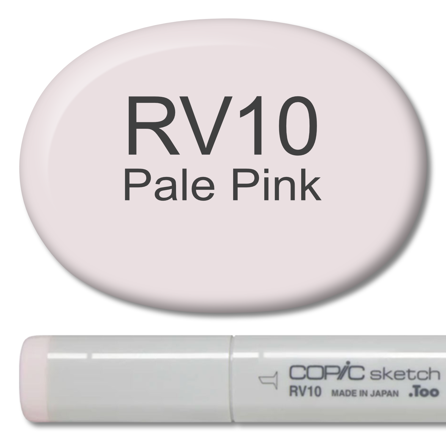
Copic Marker RV10 Pale Pink
RV10 is a very soft pink, perfect for backgrounds, florals, food, faces, animals, and springtime images. We rate RV10 an easy blending color and recommend it for beginners, especially when blended with RV13 and RV17.
Learn more about RV10:
Video Link: How to Clean and Maintain Your Copic Markers
Refill: RV10 Refill here. We recommend purchasing a refill with your Sketch Marker. Blending is significantly easier with a full marker.
About Copic Sketch Markers: Sketch are a dual-ended marker with Copic’s exclusive Super Brush Nib on one end for juicy and expressive strokes. The other end is a Medium Broad (chisel style) nib for precise lettering and drawing. Sketch style Copics have an ergonomic oval body and are the most comfortable style of Copic for long coloring sessions and for those with arthritis.
NOTE: Due to manufacturer restrictions, Copic Items can only be shipped to the USA and Canada (excluding the island of Oahu, Hawaii).
Disclaimers:

B04 Tahitian Blue is a clean medium blue for general blue coloring.
B04 is one of Copic’s best selling blue markers and is very popular with marker instructors. B04 is a traditional medium blue. It’s ideal for backgrounds, skies, water, and blue eyes. It’s an extremely good value marker for any beginner collection. We rate B04 as a moderately easy blending color and recommend it in combination with B02 and B06.
Learn more about B04:
Video Link: How to Clean and Maintain Your Copic Markers
Refill: B04 Refill here. We recommend purchasing a refill with your Sketch Marker. Blending is significantly easier with a full marker.
About Copic Sketch Markers: Sketch are a dual-ended marker with Copic’s exclusive Super Brush Nib on one end for juicy and expressive strokes. The other end is a Medium Broad (chisel style) nib for precise lettering and drawing. Sketch style Copics have an ergonomic oval body and are the most comfortable style of Copic for long coloring sessions and for those with arthritis.
NOTE: Due to manufacturer restrictions, Copic Items can only be shipped to the USA and Canada (excluding the island of Oahu, Hawaii).
Disclaimers:

Copic Marker V04
V04 is a bright pinkish violet, perfect for florals and candy. We rate V04 an easy blending color, working best when used in a blending combination with V01 and V06.
Learn more about V04:
Article Link: Copics Uncapped V04
Video Link: How to Clean and Maintain Your Copic Markers
Refill: V04 Refill here. We recommend purchasing a refill with your Sketch Marker. Blending is significantly easier with a full marker.
About Copic Sketch Markers: Sketch are a dual-ended marker with Copic’s exclusive Super Brush Nib on one end for juicy and expressive strokes. The other end is a Medium Broad (chisel style) nib for precise lettering and drawing. Sketch style Copics have an ergonomic oval body and are the most comfortable style of Copic for long coloring sessions and for those with arthritis.
NOTE: Due to manufacturer restrictions, Copic Items can only be shipped to the USA and Canada (excluding the island of Oahu, Hawaii).
Disclaimers:

Copic Marker B63 Light Hydrangea
B63 is a soft periwinkle style blue with strong hints of violet. It’s perfect for coloring florals, landscapes, clothing, and a wide variety of cheerful projects. We rate B63 an easy blending color and highly recommend it for beginners. B63 works well in combination with B60 and B66 but it also works as an underpaint under many other colors.
Learn more about B63:
Video Link: How to Clean and Maintain Your Copic Markers
Refill: B63 Refill here. We recommend purchasing a refill with your Sketch Marker. Blending is significantly easier with a full marker.
About Copic Sketch Markers: Sketch are a dual-ended marker with Copic’s exclusive Super Brush Nib on one end for juicy and expressive strokes. The other end is a Medium Broad (chisel style) nib for precise lettering and drawing. Sketch style Copics have an ergonomic oval body and are the most comfortable style of Copic for long coloring sessions and for those with arthritis.
NOTE: Due to manufacturer restrictions, Copic Items can only be shipped to the USA and Canada (excluding the island of Oahu, Hawaii).
Disclaimers:
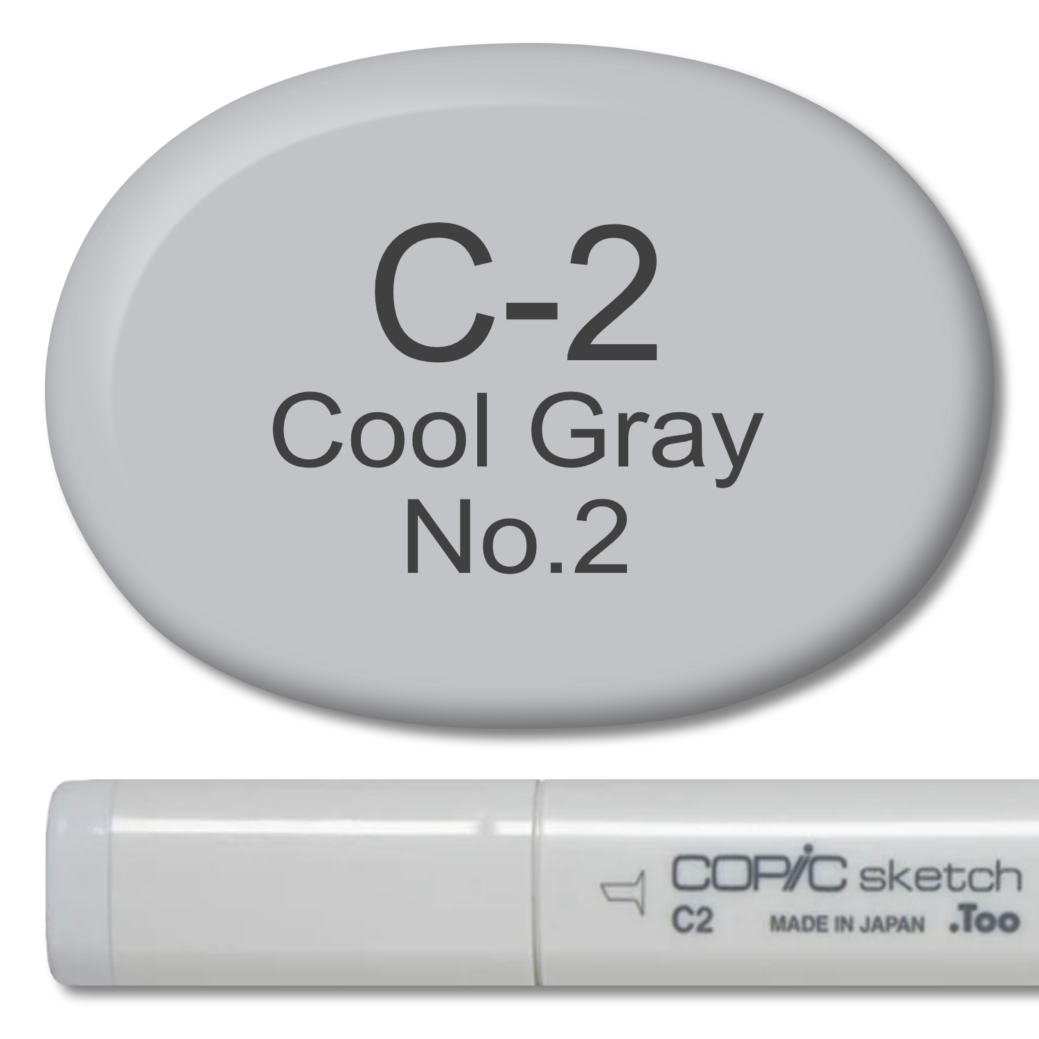
Copic Marker C2 Cool Gray
C1 is a light cool toned gray, ideal for backgrounds, shadows, and underpainting cool tones.
Learn more about C2:
Article Link: Copics Uncapped C2
Video Link: How to Clean and Maintain Your Copic Markers
Refill: C2 Refill here. We recommend purchasing a refill with your Sketch Marker. Blending is significantly easier with a full marker.
About Copic Sketch Markers: Sketch are a dual-ended marker with Copic’s exclusive Super Brush Nib on one end for juicy and expressive strokes. The other end is a Medium Broad (chisel style) nib for precise lettering and drawing. Sketch style Copics have an ergonomic oval body and are the most comfortable style of Copic for long coloring sessions and for those with arthritis.
NOTE: Due to manufacturer restrictions, Copic Items can only be shipped to the USA and Canada (excluding the island of Oahu, Hawaii).
Disclaimers:
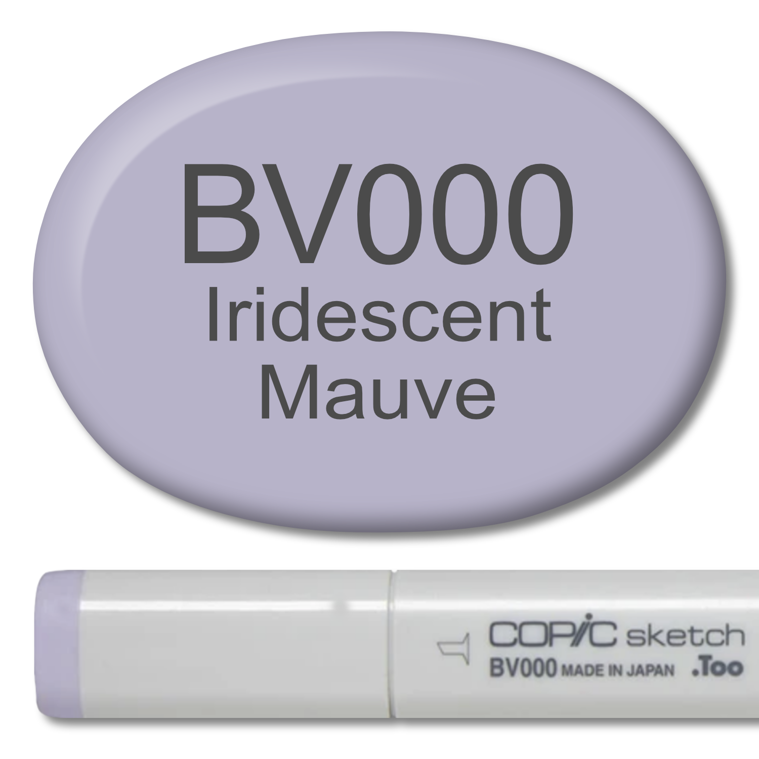
Copic Marker BV000 Iridescent Mauve
BV000 is a pale violet color which is ideal for backgrounds, florals, and spring images. We rate BV000 as an easy blending color and recommend it for beginners in combination with BV02 and BV04.
Learn more about BV000:
Video Link: How to Clean and Maintain Your Copic Markers
Refill: BV000 Refill here. We recommend purchasing a refill with your Sketch Marker. Blending is significantly easier with a full marker.
About Copic Sketch Markers: Sketch are a dual-ended marker with Copic’s exclusive Super Brush Nib on one end for juicy and expressive strokes. The other end is a Medium Broad (chisel style) nib for precise lettering and drawing. Sketch style Copics have an ergonomic oval body and are the most comfortable style of Copic for long coloring sessions and for those with arthritis.
NOTE: Due to manufacturer restrictions, Copic Items can only be shipped to the USA and Canada (excluding the island of Oahu, Hawaii).
Disclaimers:

Copic Marker B97 Night Blue
B97 is a beautiful and dark blue which resembles new blue jeans.
It can be easy for beginners to go overboard when buying blues, so we recommend buying a full color group— we highly recommend the B-Ninety family, especially for those who color a lot of clothing due to its resemblance to denim.
B97 is moderately easy to blend and we recommend it in combination with B95 and B99. This blending combination is suitable for beginners.
Learn more about B97:
Video Link: How to Clean and Maintain Your Copic Markers
Refill: B97 Refill here. We recommend purchasing a refill with your Sketch Marker. Blending is significantly easier with a full marker.
About Copic Sketch Markers: Sketch are a dual-ended marker with Copic’s exclusive Super Brush Nib on one end for juicy and expressive strokes. The other end is a Medium Broad (chisel style) nib for precise lettering and drawing. Sketch style Copics have an ergonomic oval body and are the most comfortable style of Copic for long coloring sessions and for those with arthritis.
NOTE: Due to manufacturer restrictions, Copic Items can only be shipped to the USA and Canada (excluding the island of Oahu, Hawaii).
Disclaimers: